Creative Sidewalk Chalkboard Art by Ollie Wolff Pruitt

pruitt-chalkboard

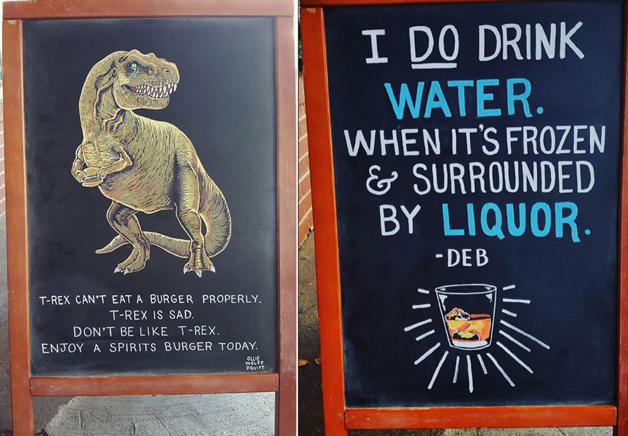
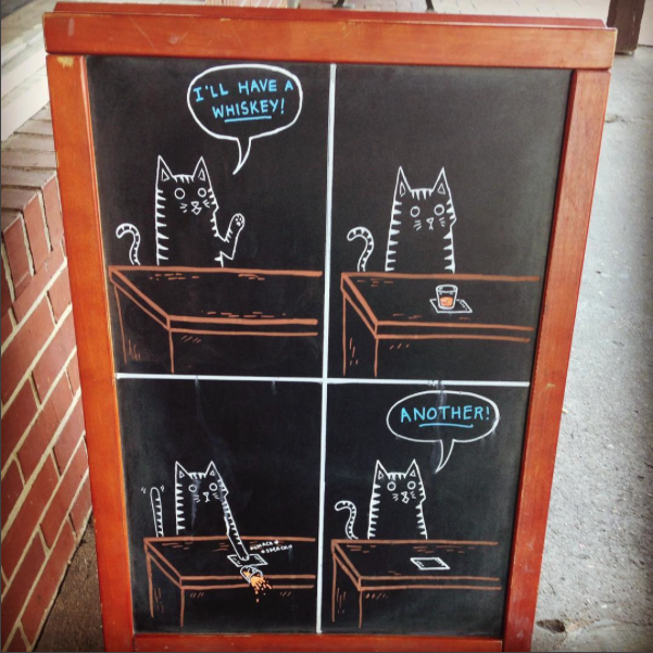
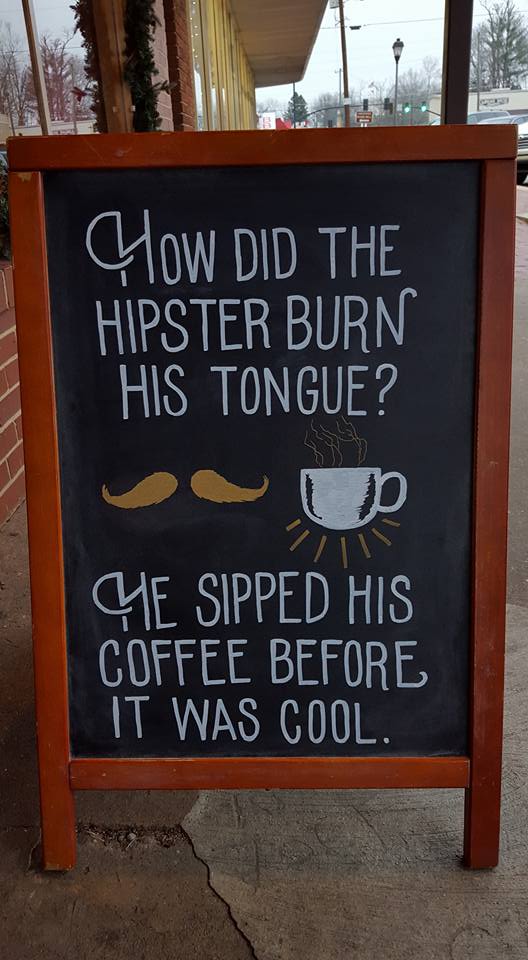
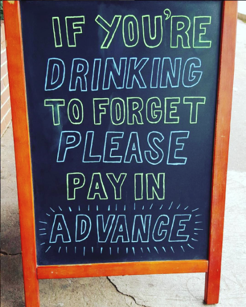
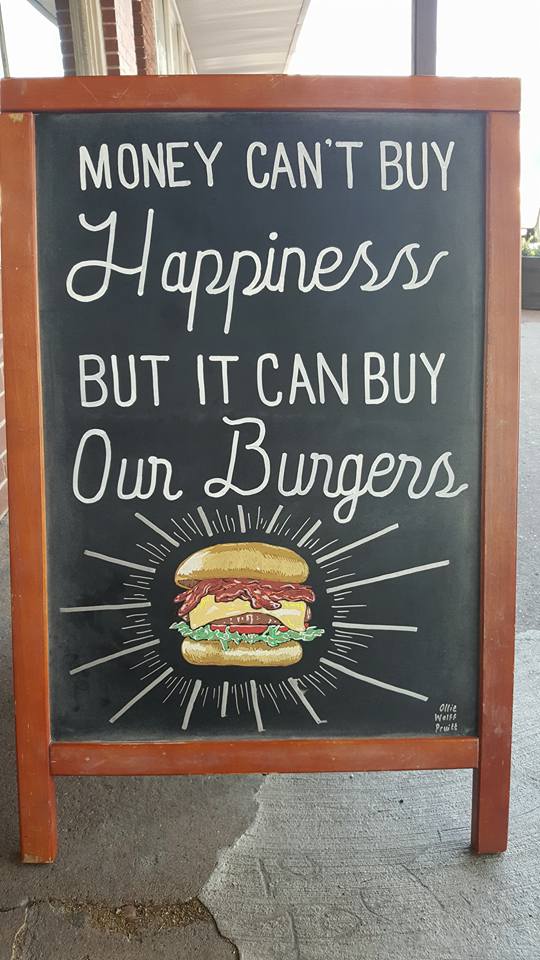
Sidewalk chalkboards may seem like an antiquated way to drive customers in. However, when used correctly, that chalkboard could become a business’ best form of marketing.

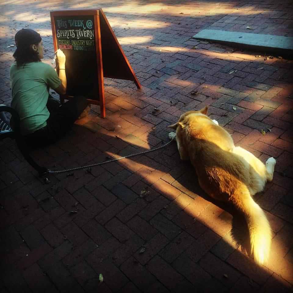
This series, by Ollie Wolff Pruitt, proves this. Pruitt started creating chalkboard signs for her friend’s bar in Dahlonega, Georgia. The sidewalk art not only helped improve business, but was also featured in a local newspaper, giving the artist and bar some great free publicity.

Of course, Pruitt doesn’t just list the happy hour and food specials on her chalkboards. What gets people in the door is Pruitt’s creative use of illustration, typography and wordplay. Occasionally, she even borrows ideas from comic masters such as The Oatmeal.

See more below and over on Pruitt’s imgur page.

8pybnrc-1

c84ruo7

1chptvt

cznrszr

jj0fhex

[link, via Bored Panda]

Artist Reinterprets Brand Logos With Hand-drawn Illustration and Typography

nutella-hand-drawn

Graphic artist and calligrapher, David Milan, has a new project for the brand-loyal typophiles out there.

David uses his illustration and lettering skills to recreate familiar brand logos by hand. Nutella becomes even more appealing [if that’s even possible] with an elegant hand-drawn typeface — while 7-11 now looks nothing like the place you’d find murder-dogs and Slurpees at.

Check out more below, and more of Milan’s work over on Instagram.

A photo posted by David Milan (@mdemilan) on

A photo posted by David Milan (@mdemilan) on

A photo posted by David Milan (@mdemilan) on

[link, via designtaxi]

Breakup Cakes and Pies Will Let You Down Easy

cant-say-we-didnt-try-final

Breaking up is hard to do. So, to help make the process a bit easier, artist Isabella Giancarlo is encouraging the breaker-upper to become a baker.

Eat Your Heart Out is a fun project that takes the most passive-aggressive and cliché break-up lines, and turns them into delicious baked goods.

So, imagine how much easier it will be, to not have to write an impersonal text or email. And, for the heartbroken, there’s always pie. Giancarlo is actually encouraging submissions for breakup lines here.

i-wish-i-met-you-in-a-year

i-am-so-sorry
more-as-my-sister-baked-Giancarlo

i-cant-do-this

[link, via BuzzFeed]

Food Typography Used To Spell Out Popular Idioms

food-idioms-1

This week, we’ve seen an awesome food typography series and a bunch of food idioms. Now, those concepts are together in one handy post.

Artist Ilona Samcewicz-Parham created Hungry Workshop — a series of food typography that’s used to spell out popular food idioms. More can be seen below and over on Instagram.

food-idioms-15

food-idioms-3

food-idioms-4

food-idioms-2

food-idioms-5

food-idioms-6

[link, via designtaxi]

Edible Typography Spells Out The Food Being Used

sainsburys_coffee

What better way to advertise food, than to play with it?… artistically of course. That’s what UK agency Side by Side did for this campaign for local supermarket retailer Sainbury’s.

Using the appropriate food, the words are created and styled by hand on the appropriate background. See the process in the video below.

sainsburys_honey

sainsburys_horseradish

sainsburys_chorizo

sainsburys_darkchoc

Just another spaghetti bolognese? Not this week. This is spag bol with coffee! A twist on the midweek favourite. #LittleTwists. Get the recipe:https://bit.ly/1L9u1ls

Posted by Sainsbury’s on Tuesday, September 15, 2015

[link, via designtaxi]