Food Typography Used To Spell Out Popular Idioms

food-idioms-1

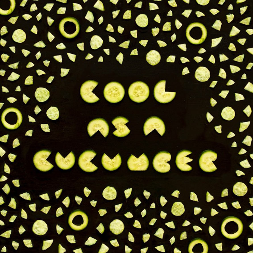
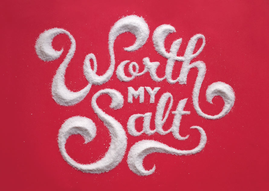
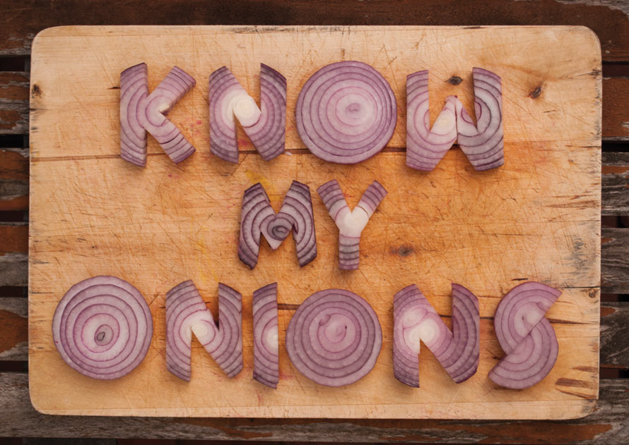
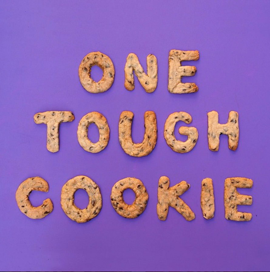
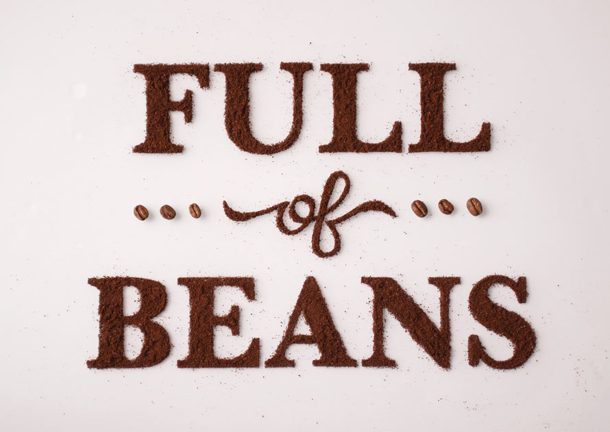
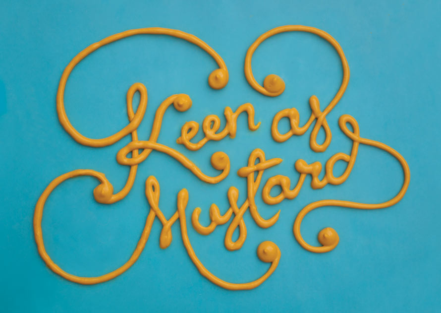
This week, we’ve seen an awesome food typography series and a bunch of food idioms. Now, those concepts are together in one handy post.

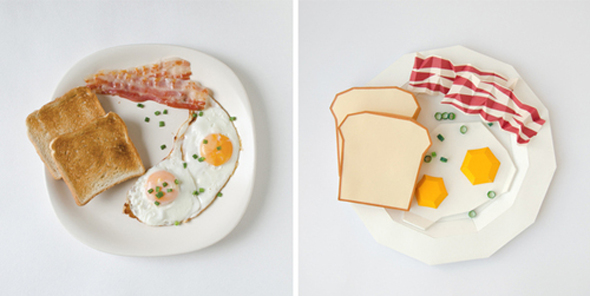
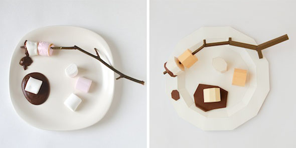
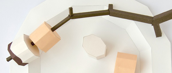
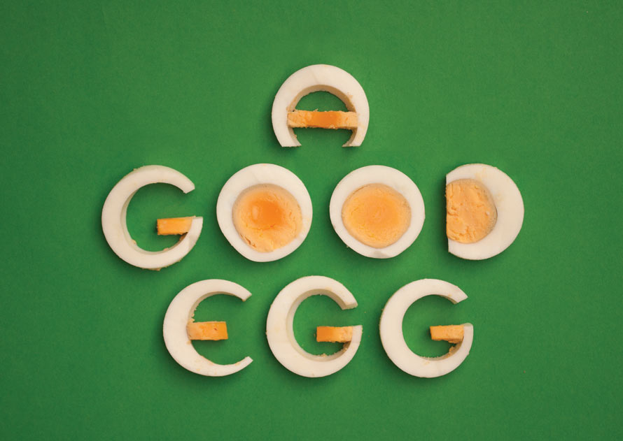
Artist Ilona Samcewicz-Parham created Hungry Workshop — a series of food typography that’s used to spell out popular food idioms. More can be seen below and over on Instagram.

food-idioms-15

food-idioms-3

food-idioms-4

food-idioms-2

food-idioms-5

food-idioms-6

[link, via designtaxi]

Taste The Font, What Certain Fonts Might Taste Like If They Were Food

tumblr_mpucwsbqd11qd8br9o2_500

Brought to us by Lithuania-based studio Prim Prim, Taste The Font explores what some well-known fonts might taste like if converted to food.

Using some intricate papercraft, Prim Prim converts Times into a plate a bacon of eggs, with the rationale that the font was created to be enjoyed in the AM by ham and eggers. Comic Sans naturally becomes marshmallows, because Comic Sans is fluffy, empty, and has no nutritional value. See more here.

tumblr_mpucwsbqd11qd8br9o1_500 ttf galutinis-gamybai

4

5 ttf galutinis-gamybai


7

8 ttf galutinis-gamybai


[via designboom]