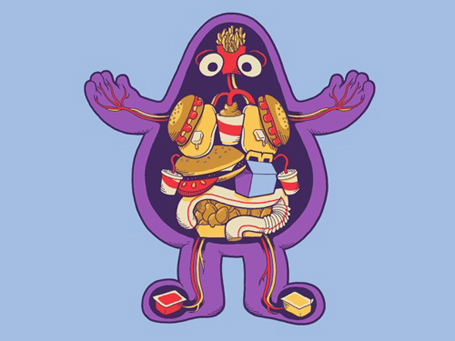
Campbell’s Soup Redesign

Campbell’s Soup has recently redesigned their labels using the process of mindfucking neuromarketing.

Here at foodiggity we are a bit disturbed by the shunning of the spoon. However, as a former art director myself, I say well done Campbell’s. I shall continue to use your creamed soups in future casseroles.

[via Good Blog]

More information on ‘neuromarketing’ can be found here.

Look to The Cookie: The Importance of Black and White

photo: kevinvanaelst.com

“Look to the cookie Elaine… Look to the cookie.” ~J. Seinfeld

Black and white. One is the combination of all colors, while the other is the absence of color. When mixed together they make gray. A more boring duo one could not find. However, sometimes these complementary opposites come together to produce greatness. Foodiggity explains.

Continue reading “Look to The Cookie: The Importance of Black and White”