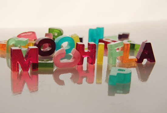
Lucía Rallo and Aranxa Esteve, of m-inspira, recently created the jiggliest of all fonts using edible gelatin. They can be used to spell out your name in beautiful colors, or to teach your kids the alphabet — one gelatinous letter at a time.

The Greatest Food Culture Site Ever*

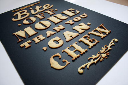
With the help of some dough, X-Acto blades and some sick typography skills — British designer Anna Garforth created the Edible Poster.
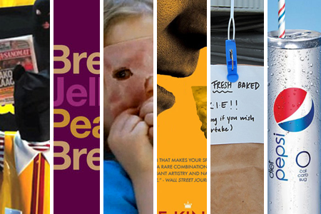 McHostages, Font Sandwiches, and Cookies From Above… It’s Foodiggity’s Best of The Week.
Save The Clown… Ronald McDonald Has Been Kidnapped
Meat, bread, and vapid fonts… Helvetica Sandwiches
AAAAAAAHH!!!!… Ham Face Girl
And, the nacho-nees are… Oscars Best Picture Nominees, Nacho-fied
Food trucks are so street level… Pull String, Receive Cookies
Cans giving complexes… Pepsi’s Slim Can Is Nothing New

Type Sandwiches, by artist David Schwen, is a series inspired by meat-in-between-bread and the most vapid of all fonts. Using only color and Helvetica, Schwen very simply depicts some popular sandwiches, including The Reuben, BLT, and the classic PB & J.

Prints are available here.

As food manufacturers continue to compete for your attention and coupon use, their packaging has become increasingly obnoxious. Anyone who has wheeled down a cereal aisle lately can attest to the increasing amount of garish colors and the come-hither stares of cartoon spokesmen. We think their eyes might actually follow you too.
Design firm Antrepo experimented with the recent minimalist design trend to see what some packaging looks like when stripped of the mascots, extraneous colors, and superfluous graphics.
Continue reading “Food Packaging Gets a Minimalist Makeover”