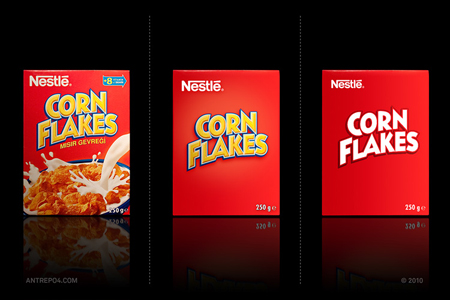
As food manufacturers continue to compete for your attention and coupon use, their packaging has become increasingly obnoxious. Anyone who has wheeled down a cereal aisle lately can attest to the increasing amount of garish colors and the come-hither stares of cartoon spokesmen. We think their eyes might actually follow you too.
Design firm Antrepo experimented with the recent minimalist design trend to see what some packaging looks like when stripped of the mascots, extraneous colors, and superfluous graphics.
Whittled down to the product name, and in some cases as few as one printed color, the exercise asks some interesting questions… Do product manufacturers and designers need to take a step back in order to stand out? And are we finally succumbing to our ever-shortening attention spans?
However, this minimalist approach could make certain jobs and skill sets unnecessary. Think of the printers who can no longer overcharge for six-color jobs. The graphic artist who specializes in searing eyeballs, or the food stylist who makes milk cascade like no other.
What do you think of this approach? Would any of these stand out to you on the overpopulated supermarket shelves? Or do you just say ‘meh’, gimme my cartoon tiger?


I like the clean and simple packaging very much.
I think it might be an real option for some branches.
While it is an interesting idea, one question comes to mind….Appetite appeal? Without it, it’s very hard to sell food. And while the examples show two brands with very good brand recognition, what about all the other ones that lack that and rely on the food industry experts to market them. Experts like the food stylist, the photographer & the art director? Minimalist design does have a place, just not always when it comes to food.
Your idea is good and worth thinking. But imagine a shop full of packages contain nothing but screaming bold types on.But I also belive every products should have character with graphics, theme, typography and style. How ever I believe in minimalistic design implementations. But the example you shown here are big brands easily withstands as color and form achieved throughout decades. Even one illiterate can identify them in a shelf.