Um, This Ketchup Is Kinda Racist

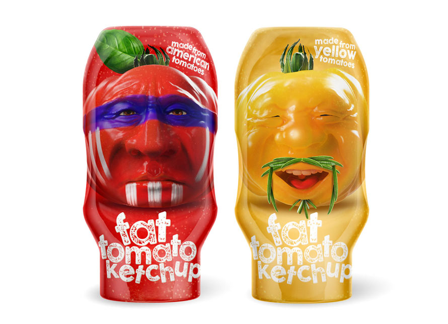
There’s a new packaging concept for Fat Tomato Ketchup that comes in two varieties, red and yellow. The yellow version uses yellow tomatoes to pay homage to ketchup’s Asian origins, while the red is proud of its use of American tomatoes.

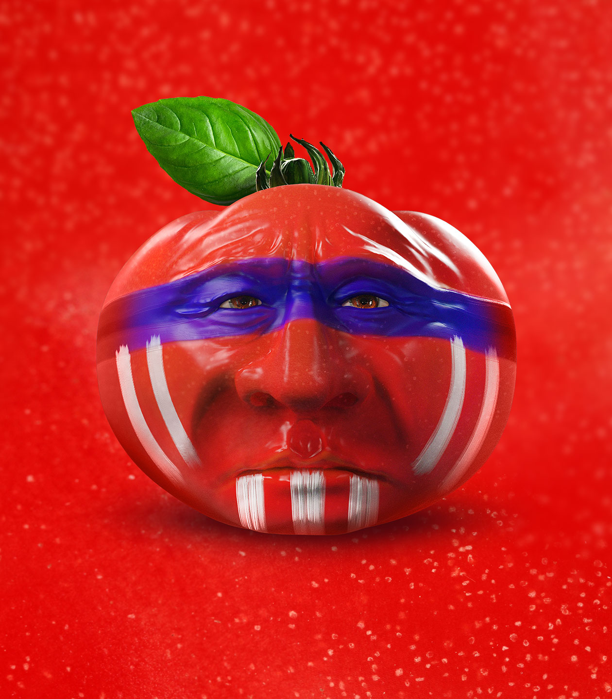
The packaging by Czech firm, MAISON D IDEE Prague, created fun characters with creative use of 3-D rendering, and… wait a minute… Is that a Native American tomato? Hold on a sec… Did they… Is that an Asian person as a yellow tomato? Wow, that went off the rails pretty quickly.

The designers, while explaining their use of the characters, provide such a genuine lesson in ketchup history and origin, that it’s hard to get angry at their obliviousness.

“We were delighted that we could connect the yellow packaging with a oriental character of the tomato. Finally at least something points to the origin of this beautiful westernized word ‘ketchup’. This word of a sauce made of fermented fish or mushroom paste (sources differ) was brought to Europe by sailors (most likely under Eastern Indian’s influence) from China on the turn of 18th century.”

Of course, this concept wouldn’t make it past a sketch pad in the U.S. What do you think? Cute, forgivably ill-advised, slightly racist, or all of the above?

via packaging of the world

The Fruit Sticker T-shirt Is Bananas

Fruit stickers are small, unassuming and under-appreciated. However, these little oblongs, squares and rhombi make fine collectibles, and often employ a brilliant use of design and typography. Now, the versatile decals are a t-shirt.

The Fruit Sticker T-shirt is brought to us by art project, Fruit Stickers, and shirt-maker Everpress. The tees are now available for pre-order and, the best part, is that each one comes with a set of fruit stickers. No trip to the produce section necessary.

link via booooooom

There’s Unicorn Dr. Pepper Now

via Instagram @JunkFoodMom

Dr. Pepper, already rumored to contain unicorn tears, has all but confirmed this with Unicorn Dr. Pepper.

The labels are part of the doctor’s “Pick Your Pepper” campaign, where you can find a unique label to fit your personality. Although each bottle contains the same wonderful Dr. Pepper, the unicorn label will always be the most appropriate. You know, because of the tears.

via Instagram @JunkFoodMom

link

KFC Hot and Spicy Chicken Is Fire In These Clever Ads

KFC Hong Kong wants to imply that their Hot & Spicy Chicken is hot. And, if these print ads by Ogilvy Hong Kong are any indication, the chicken is burning rocket fuel-type hot.

With the use of creative placement and clever lighting, actual KFC chicken parts are used to represent fire and smoke. The space shuttle has lift-off, indicated by the drumsticks and wings it leaves behind, while imitation Power Rangers pose in front of a chicken explosion.

via adweek

Pantone Spices Are A Match For Your Meals

If you’ve ever needed to color match your herbs and spices to a particular meal, Pantone Style Spices are here to help.

Brought to us by Hungarian art director, Peter Bakonyi, the minimalist packaging adopts the color of the spices within, and is designed to look like a Pantone swatch.

[link, via designtaxi]