
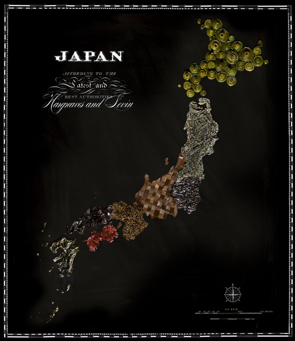
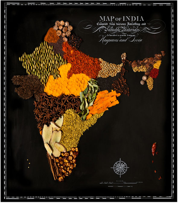
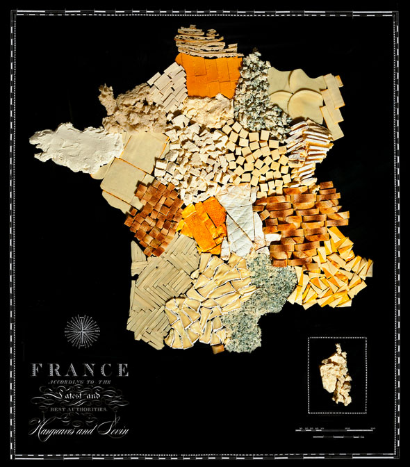
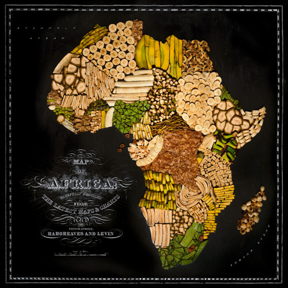
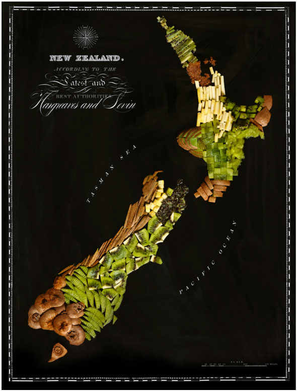
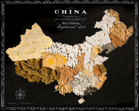
Inspired by their passion for travel, artists Caitlin Levin and Henry Hargreaves created Food Maps. The series consists of countries recreated using some of the most iconic foods from each — making the maps as hunger-inducing and educational as they are nice to look at.
The US consists of its major export of corn, while Italy is unsurprisingly tomato-heavy. Check ’em all out below and let the international debate begin.




[link]

Just a beautiful way of representing the ‘worldwide web’! 🙂