
A Tribute to Budgie is a creative illustration series by food stylist Anna Keville Joyce. Created with all edible items, Joyce arranges them on plates, with the ingredients close by. Just so you don’t have to ask what’s in your bird food.
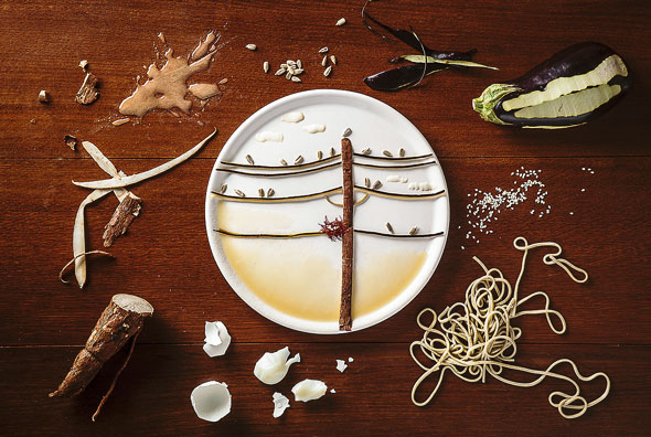


A Tribute to Budgie is a creative illustration series by food stylist Anna Keville Joyce. Created with all edible items, Joyce arranges them on plates, with the ingredients close by. Just so you don’t have to ask what’s in your bird food.

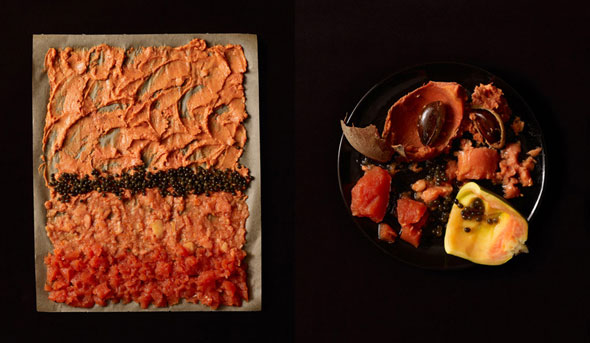
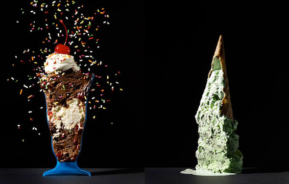
Beth Galton, recently featured here for her Cut Food series, is playing with her food again. Only this time, instead of the inside of foods becoming the focal point, Galton showcases textures and patterns with a heavy nod to modern art.
Whether it’s a plate of ingredients mashed up to create an edible Rothko, or a cold cut and condiment Pollock — the study in color and texture is set against Galton’s trademark black background, and is worthy of any museum wall. And by museum wall, we mean in my belly.


[link, via First We Feast]

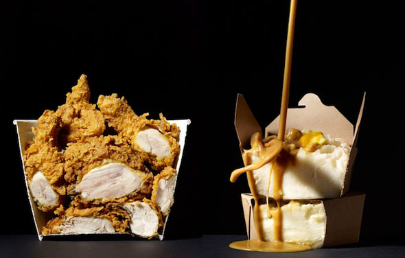
Last year, we were mesmerized by the innards of certain foods, thanks to the photo series, Cut Food. New York-based photographer Beth Galton is at it again, continuing her photo series with some new bisected foods and drinks.
The newest part of the series, just as aesthetically pleasing as the last, will have you wondering how they made the foods look like this, as well as making you a bit hungry. Perhaps for half a bucket of chicken?
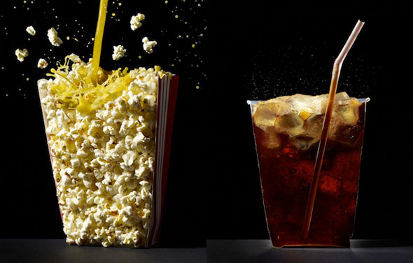
[link, via My Modern Met]
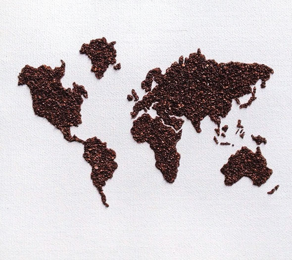
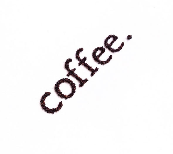
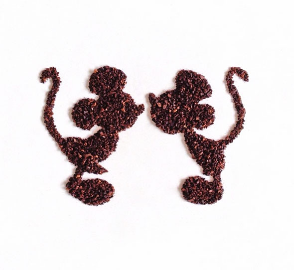
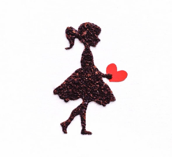
Ground coffee… It’s not just for filtering hot water through to help keep you awake. Instagram member livscreams has created a wonderful series of illustrations using coarsely-ground coffee beans.
Most of the minimalist illustrations use nothing more than the high contrast of dark coffee against a white background — with an occasional accessory for a splash of color. Now let’s run some water through this art and get the morning started.
See more of Liv’s work here.

[link, via Laughing Squid]
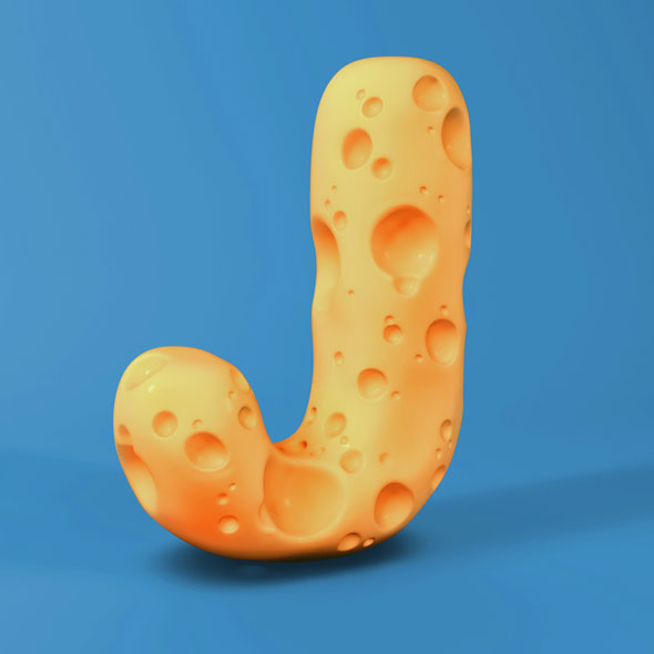
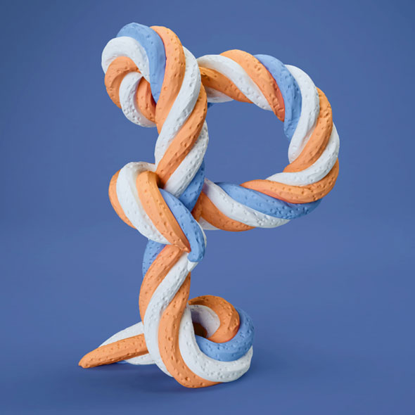
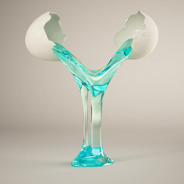
Know your 3D-rendered ABCs. The Sculpted Alphabet is brought to us by German design studio FOREAL — rendering all 26 letters using Cinema 4D.
The letters that look good enough to eat are only part of the series, as they employ various everyday objects and body parts as inspiration. However, we focused on the food-related ones because that’s how we roll.


[link, via designtaxi]