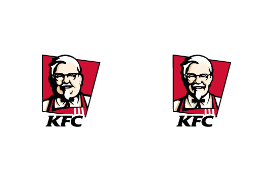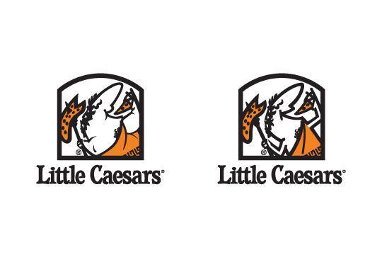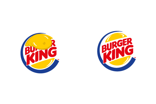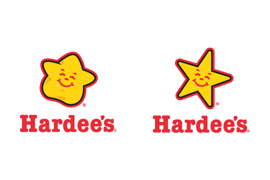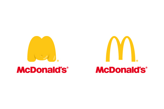
That’s How I See It is a re-imagining of some fast food and drink logos, with some painfully truthful results.
Brought to us by Saudi Arabian graphic designer, Adelbanfeel, he does a redo on a few famous icons, but fattens them up. Similar to the way these companies’ products fatten up humans. Take that, skinny golden arches and svelte Colonel Sanders…