Taste The Font, What Certain Fonts Might Taste Like If They Were Food

tumblr_mpucwsbqd11qd8br9o2_500

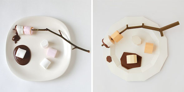
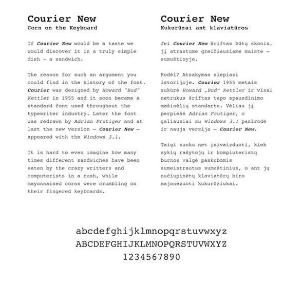
Brought to us by Lithuania-based studio Prim Prim, Taste The Font explores what some well-known fonts might taste like if converted to food.

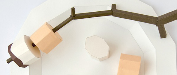
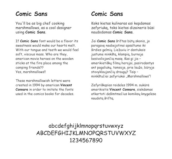
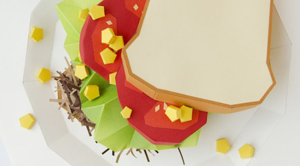
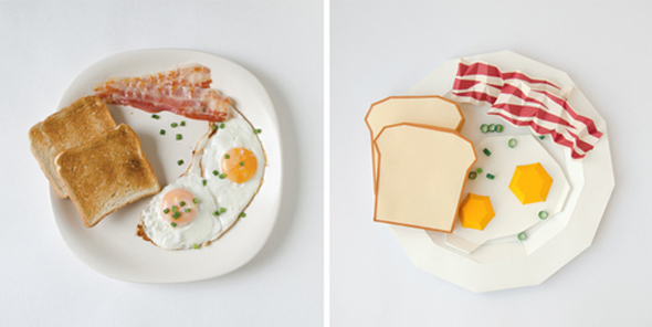
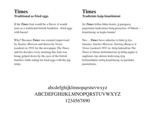
Using some intricate papercraft, Prim Prim converts Times into a plate a bacon of eggs, with the rationale that the font was created to be enjoyed in the AM by ham and eggers. Comic Sans naturally becomes marshmallows, because Comic Sans is fluffy, empty, and has no nutritional value. See more here.
tumblr_mpucwsbqd11qd8br9o1_500 ttf galutinis-gamybai

4

5 ttf galutinis-gamybai


7

8 ttf galutinis-gamybai


[via designboom]

Typography Cake

typography-cake-diy-1

We’ve all used the outside of a cake to display a message, e.g., “Happy Birthday,” “Congratulations,” or “You’re Fired.” But wouldn’t it be infinitely cooler and more creative to place the message on the inside? Athena and Victoria from A Subtle Revelry have the answer, with the Typography Cake and a font series worthy of being baked, read, and then eaten.

The recipe and technique for the Typography Cake can be found here. Just think of how much more fun it’ll be to fire someone.

typography-cake-diy-2

typography-cake-diy-3

[link]

Record Packaging Made From Sugar

twws-sugar-album

What artists have to do to sell an album these days. Well, making the album out of a giant block of sugar is a good start. For Beacon’s first LP The Ways We Separate, Brooklyn-based sculptor Fernando Mastrangelo created a 13″x13″ cast sugar housing for the vinyl record.

And everyone loves sugar… You’ll just have to explain to your friends what vinyl is. The limited edition is available for pre-order here.

beacon-the-way-we-seperate-sugar-packaging-1

twws-sugar-album-2

[link, via The Fox Is Black]

Typeface Created To Highlight The Tasting Notes Of 12-Yr-Old Scotch

1

Illustrator Steven Bonner recently designed a font set to help showcase the tasting notes found in Ballantine’s 12-yr-old Scotch. “C”, in this case, is for “citrus notes” — with an “O” for oak, and “V” for vanilla.

See more at Bonner’s website, and find out more about the project at Ballantine’s.

4

6

2

[link, via TAXI]